 100% Gratis
Lab Flask Charts for PowerPoint and Google Slides
Enhance science presentations with data visualization using Lab Flask Charts for PowerPoint and Google Slides. Dynamic, editable graphics.
Detalles de la plantilla
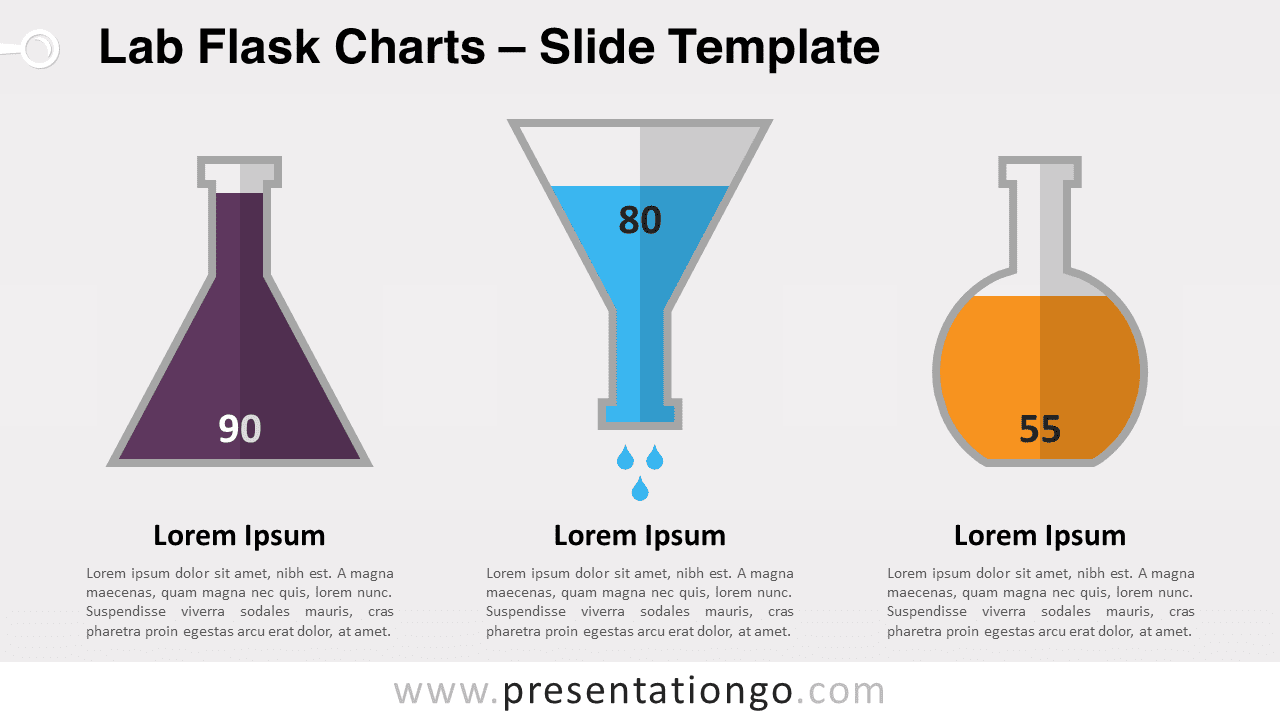
Unveil a new dimension of data storytelling with our Lab Flask Charts for PowerPoint and Google Slides – a sleek, purpose-driven design that transforms figures into visual narratives. Ideal for educators and analysts, this template turns data into captivating, easy-to-understand visual charts. In the realm of presentations, data visualization is not just a benefit; it’s a necessity. It converts rows of data into a clear visual context, making insights more accessible and memorable. Imagine lab flasks, not just as containers but as dynamic data charts that shift with your story, providing a snapshot of information at a glance. This creative embodiment of data engages the audience, enhancing both comprehension and retention. Whether you’re illustrating chemical reactions for a science class or showcasing quarterly financial results, our lab flask charts provide an innovative twist. For educators, it’s a gateway to a more interactive learning experience. For business professionals, it’s a tool to present data trends and forecasts with a novel visual hook. These charts are particularly effective when depicting growth measurements, comparative analyses, or any data that benefits from a clear, vertical scale representation. In conclusion, the Lab Flask Charts template is a powerful ally for any presenter aiming to make an impact. It’s not just about showing data; it’s about telling a story that sticks. With its editable features and dual-layout compatibility, it’s a versatile asset designed to elevate your presentation and engage your audience. Embrace the art of data with this unique, insightful template.
- Fuente
- PresentationGo
- Formato
- pptx
- Tamaño
- 144 KB
- Descargas
- 0
- Diapositivas
- 2
- Relación
- 16:9
Autor / Copyright:PresentationGo
Fuente original:PresentationGo original